
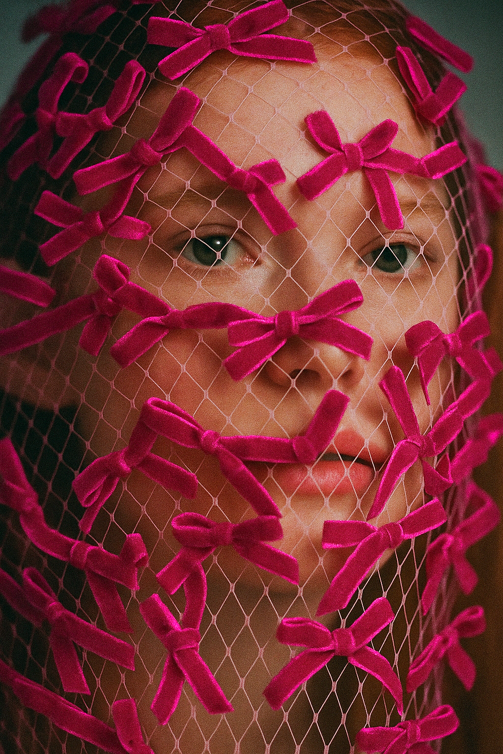
.png)
Sofija Ivanović
art director
.png)
The work is organized in chapters, each reflecting a different way my thinking translates into practice, shaping both my point of view and capabilities as an art director.
.jpg)

.png)
CHAPTER 01
POINT OF VIEW
Project driven by personal observation, cultural insight, and an intuitive response to gaps in the market.
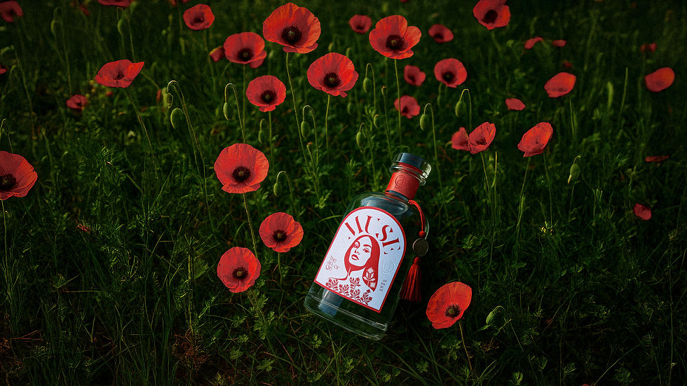
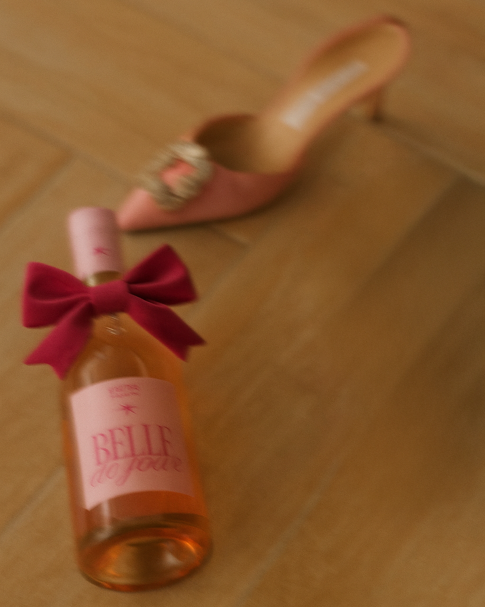
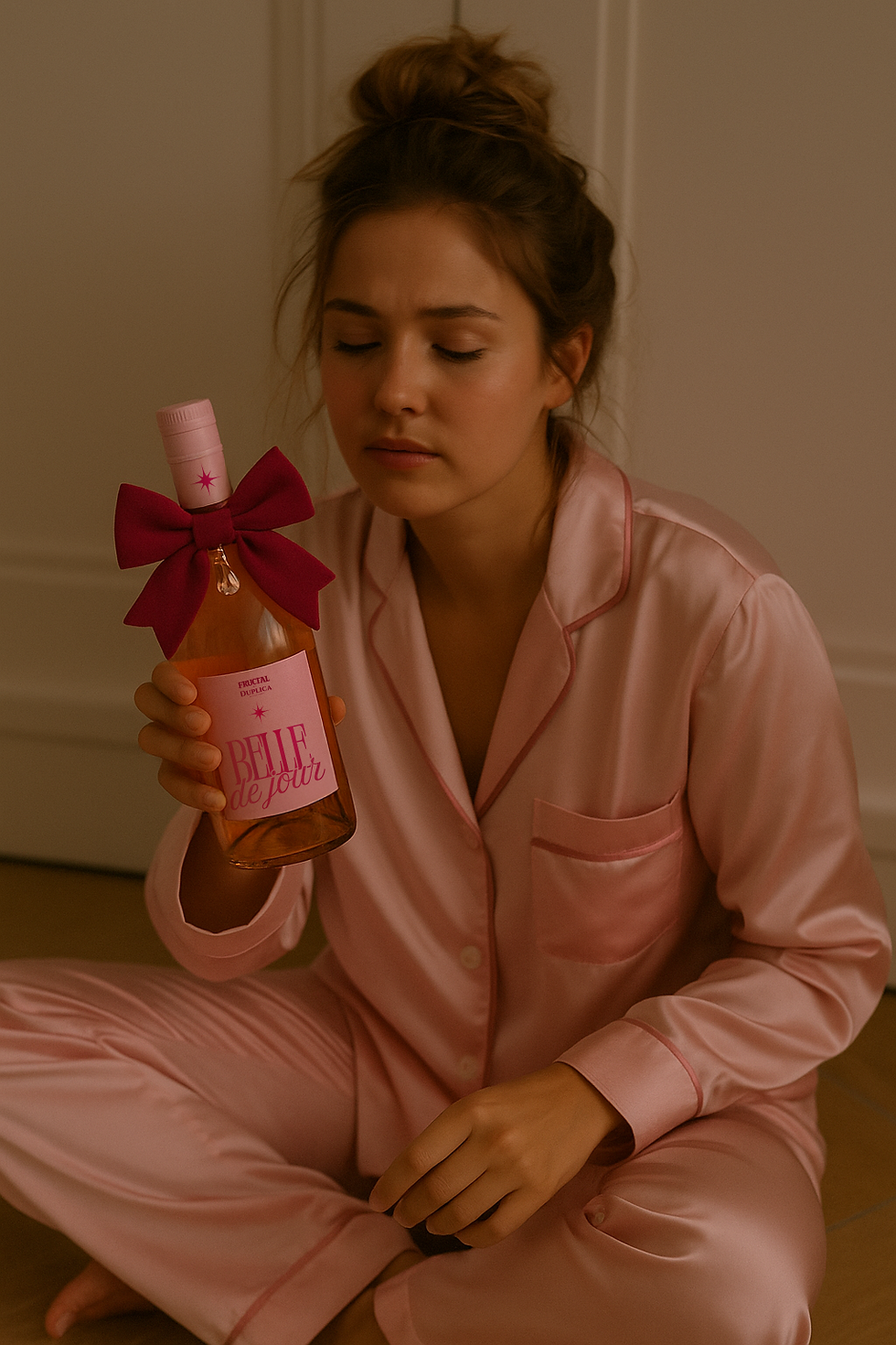
Belle De Jour
Belle de Jour was reimagined as a return of an existing product through a radically different cultural lens — one rooted in female gaze, internet aesthetics, and everyday rituals rather than traditional alcohol branding.
PUBLIC CUT
IDEA
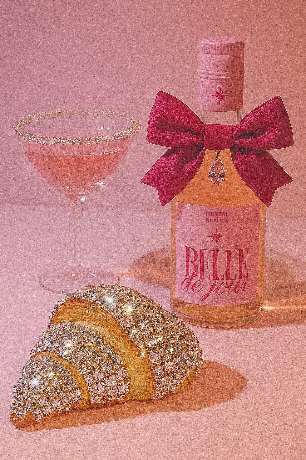
The idea was to position Belle not as a conventional product, but as a main-character persona — a brand that behaves like a person rather than a system. Belle exists in the same emotional space as lipstick, perfume, or a late-night message: personal, mood-driven, and immediately relatable.
EXECUTION
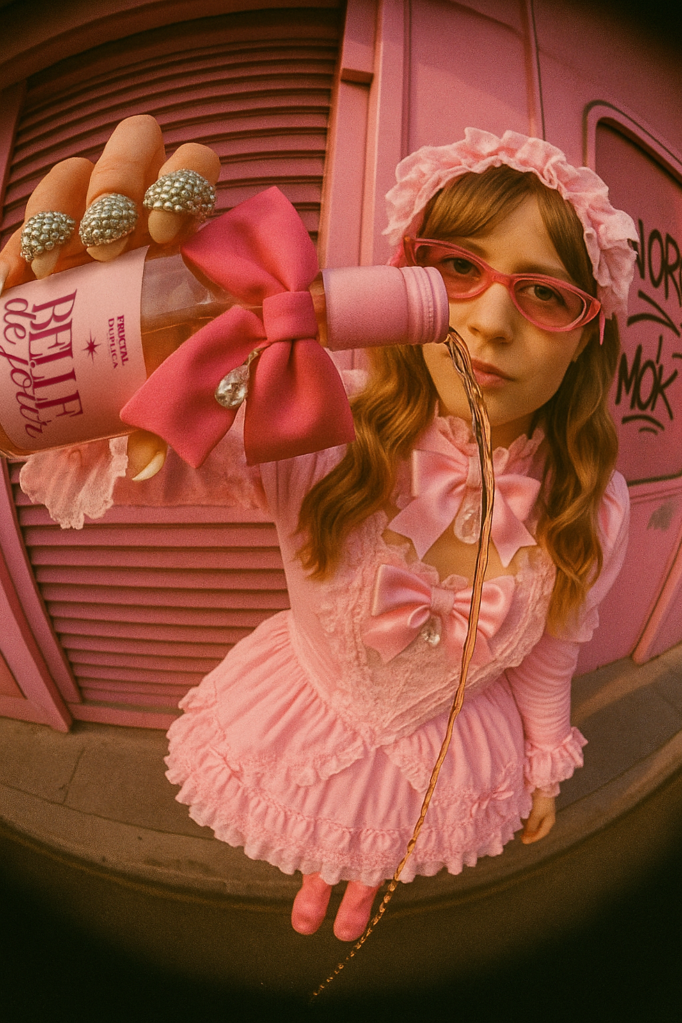
Belle operates through attitude rather than rigid rules. Visual expression shifts freely across references and aesthetics, held together by tone, humor, and cultural recognition rather than strict consistency.
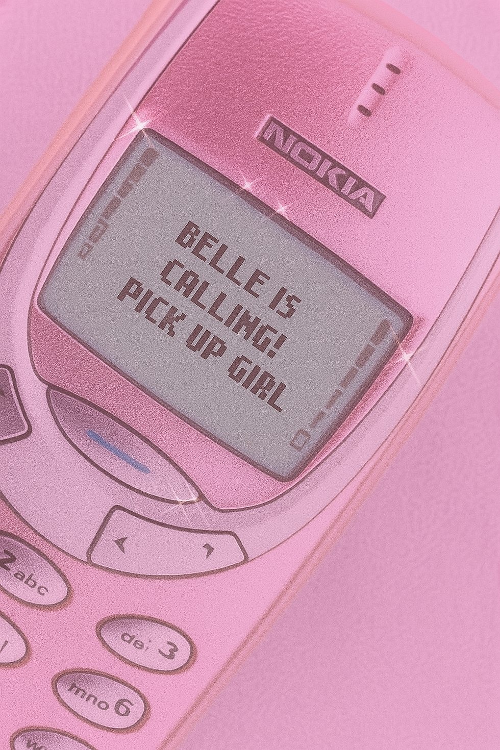
Conceived as a digital persona, Belle is designed to exist and evolve primarily through social platforms — where mood, relatability, and immediacy matter more than polish.
AI was used as a creative tool to enable rapid world-building and scalable storytelling, allowing the brand to live across multiple moods and scenarios while remaining emotionally coherent.


.png)

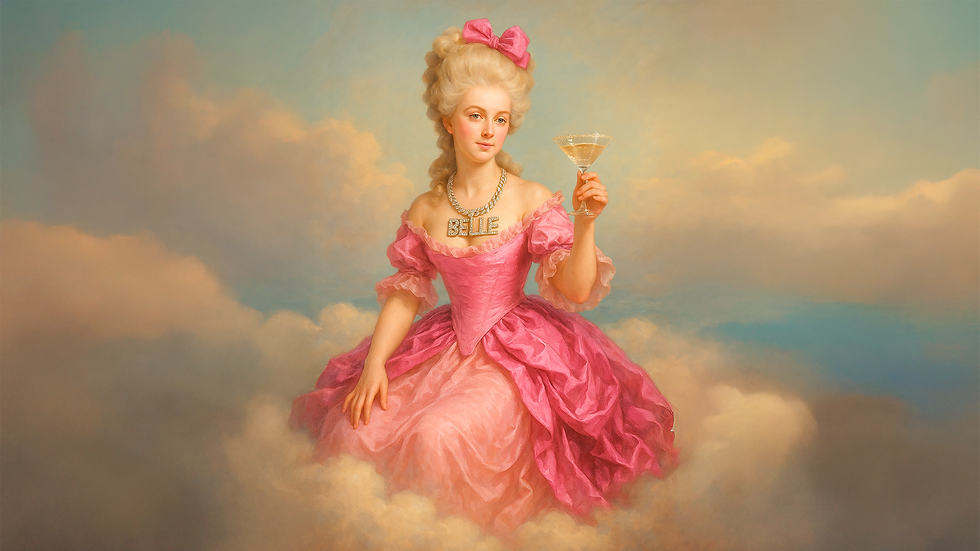
DIRECTOR'S CUT
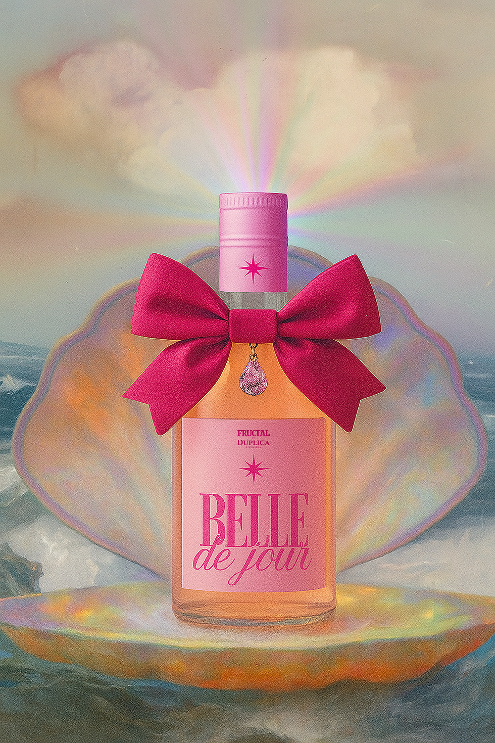
The decision to position Belle as bold, kitsch, and digitally expressive was intentional rather than stylistic instinct. Internet aesthetics — including nostalgia, early-digital references, and unfiltered visual language — were used as a framework for emotional recognition. Kitsch functions here as a strategic device: exaggerated, self-aware, culturally fluent and ironic.
The brand embraces contradiction and messiness, reflecting lived female experience while simultaneously offering an escapist fantasy that shines. Visual looseness and tonal shifts mirror how identity is performed online — through mood, humor, and fragments rather than fixed narratives. Belle moves between intimacy and excess, grounding itself in relatability while allowing space for glamour, play, and projection.
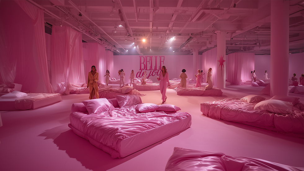
What I’d Push Further
Belle de Jour naturally extends beyond the bottle into shared, female-led experiences — such as all-women pajama party lounges and intimate pop-ups designed for unwinding rather than nightlife. Through collaborations with jewelry designers, fashion labels, and artists, the same persona could expand its cultural influence — allowing Belle to exist as a collectible, wearable, and experiential presence.

.png)
SYSTEMS
CHAPTER 02
Projects in this chapter focus on branding as a system, translating identity into structured, adaptable frameworks across multiple applications.
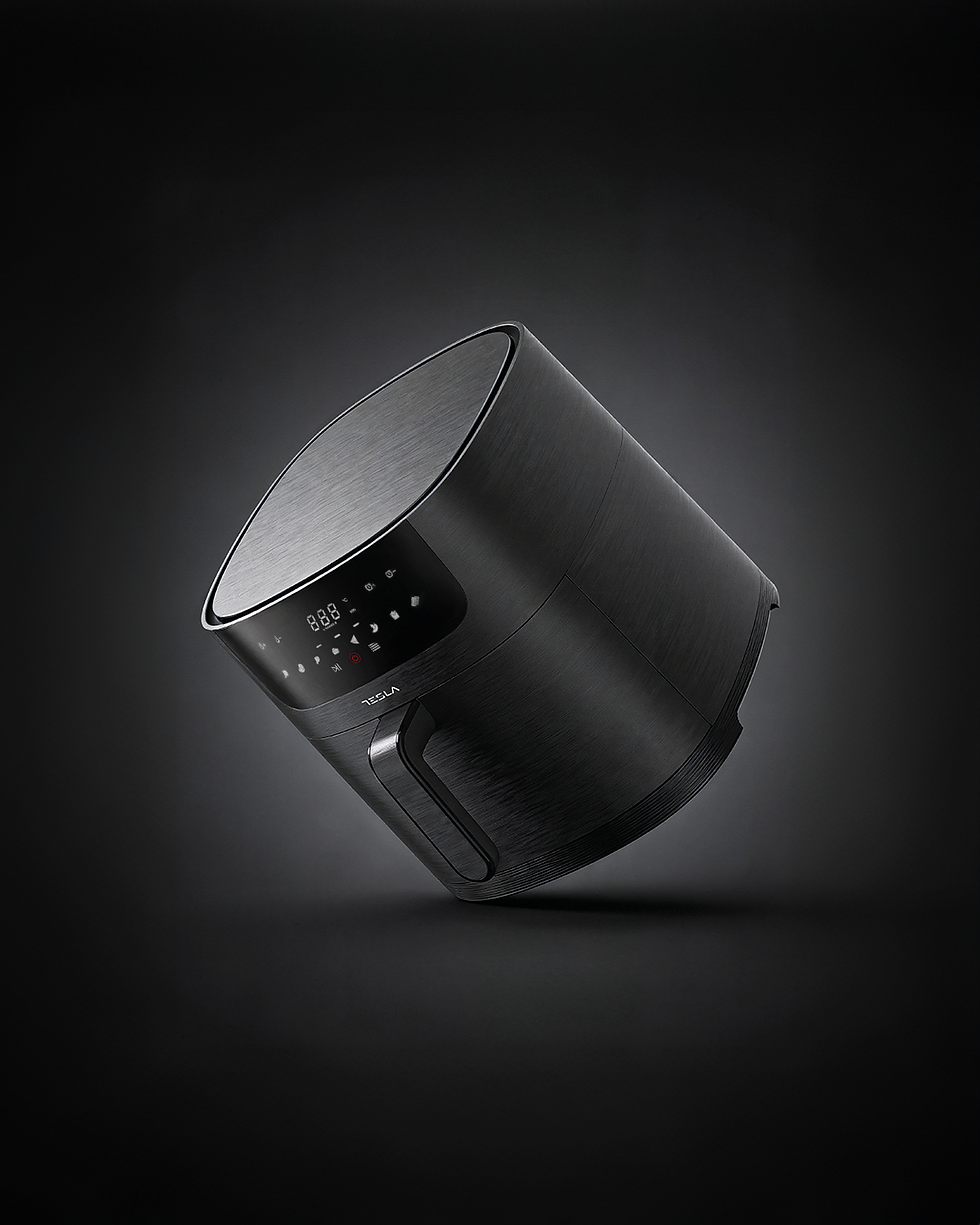
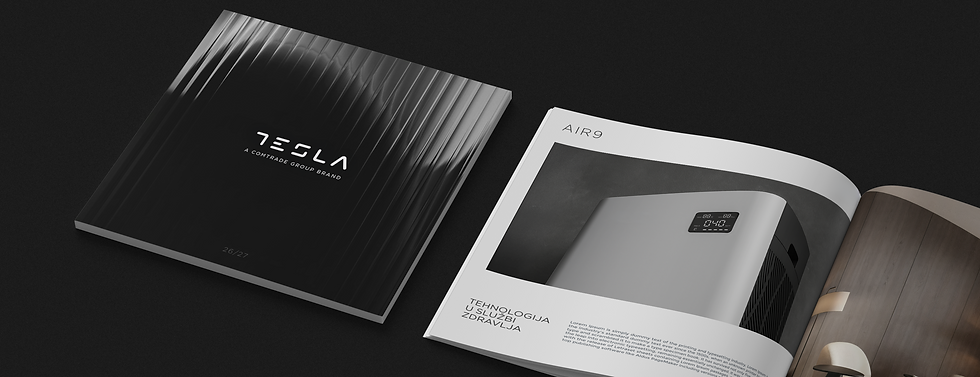
TESLA
This project approaches brand repositioning through refinement and working within existing structures to elevate perception at scale.
PUBLIC CUT
BRIEF
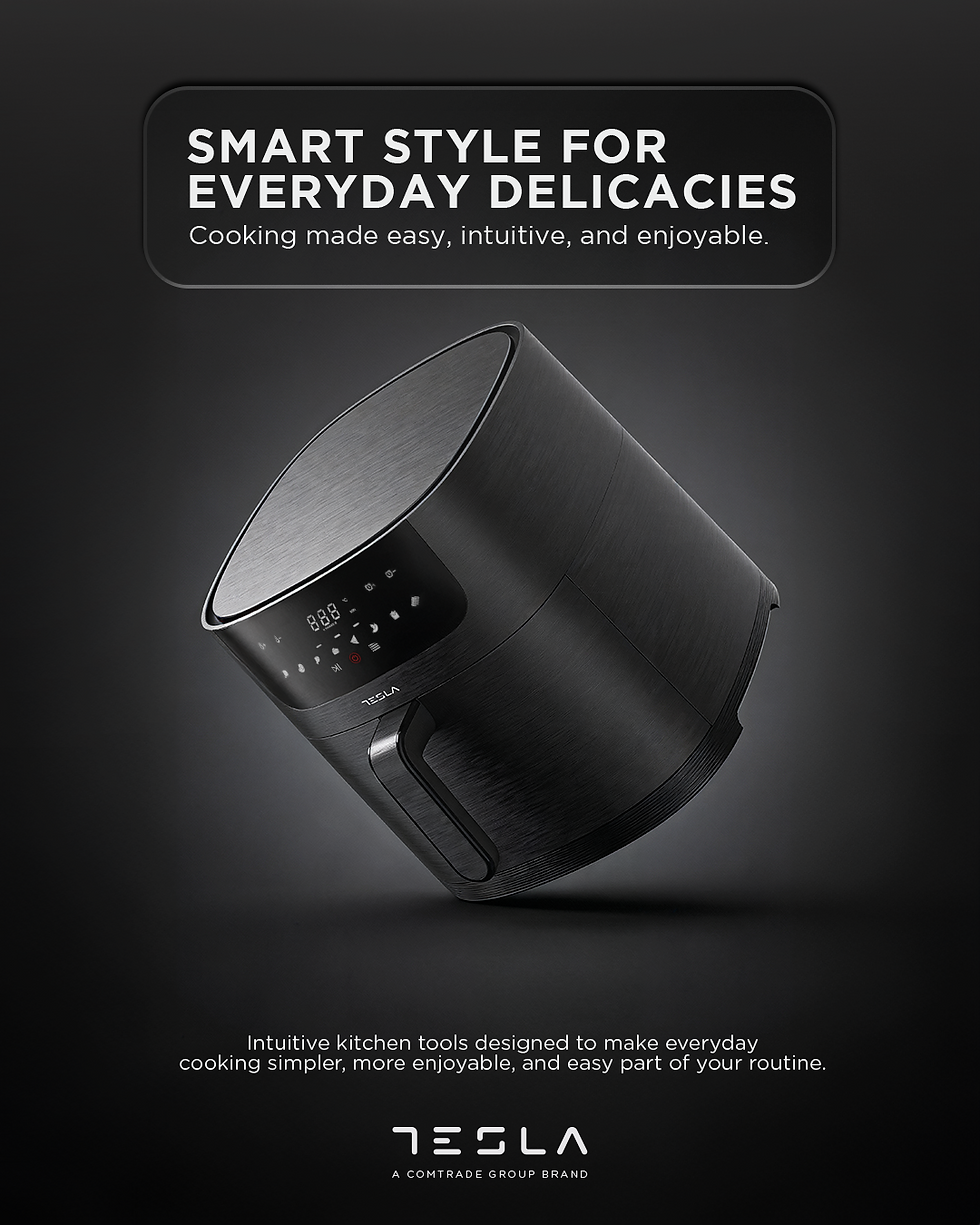
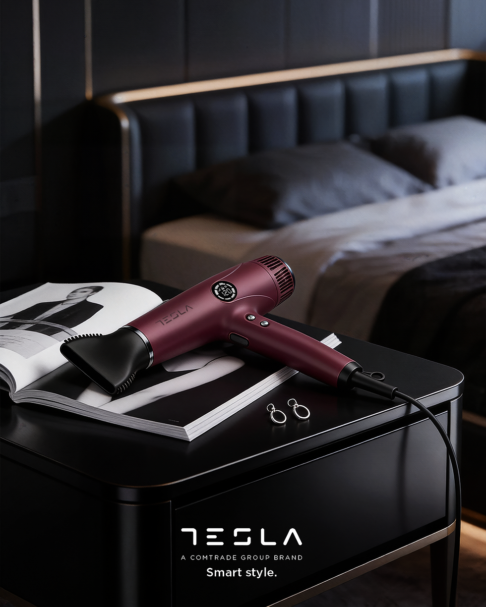
Reposition Tesla from a mass-market, utility-driven brand to a more premium one, while working within existing brand assets, a broad product range, and commercial retail constraints.
IDEA
Refinement through restraint. Instead of a full rebrand, small, precise adjustments were used to shift perception toward a calmer, more confident, and visually coherent brand.
EXECUTION
The logo was refined through adjusted kerning to improve balance and presence. A muted palette of off-white, soft gray, and restrained purple replaced the conventional blue. A modular “liquid glass” device provided
a flexible system across formats. Visual direction combined dark hero product imagery with polished interior environments. AI supported scalable product visualization in the absence of full 3D assets.
.png)


%20novi.png)
.png)
.png)


.png)

DIRECTOR'S CUT
This system was designed to give the brand tools rather than fixed outcomes. While commercial reality will often push toward dense product presentation, the framework demonstrates how clarity, spacing, and materiality can elevate perception even within trade-driven environments. The work provides a visual and structural reference for moving toward premium without losing operational flexibility.
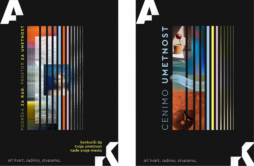
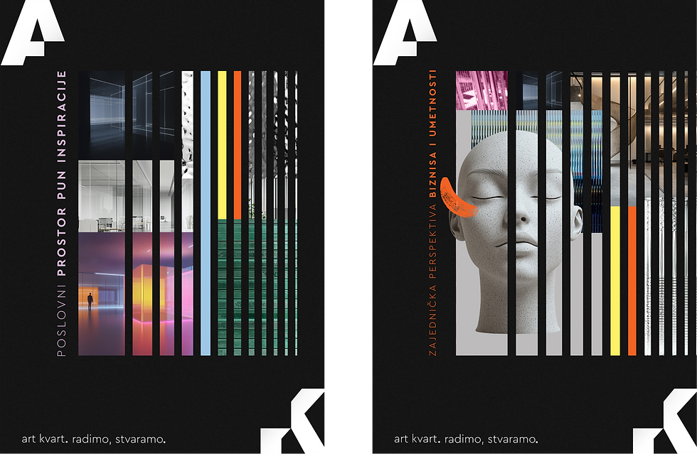
ART KVART
PUBLIC CUT
Art Kvart is a cultural reframing project developed for a business center housed in a formerly artist-occupied building in Belgrade. The identity responds to the site’s history by repositioning artistic presence within a contemporary commercial context.
The branding system is built around a modular typographic frame derived from the program’s initials. The letterforms function as an adaptable container: allowing artworks, posters, and visual content to inhabit the identity without imposing a fixed aesthetic.
The result is a restrained, flexible system that supports artistic expression while remaining structurally coherent and contemporary.
%20logo%20black.png)
_gif.gif)
.png)
_gif.gif)
_gif.gif)
_gif.gif)

DIRECTOR'S CUT
This project approaches cultural reframing through structure rather than symbolism. By reducing the identity to a framing device, the system allows meaning to emerge through use, positioning branding as an enabling layer rather than a dominant voice. The framing device was deliberately chosen to echo the building’s past as a home for artists, creating space for their work to be seen rather than overwritten.
CHAPTER 03
SPACE
Projects in this chapter explore space as a medium — translating brand identity into physical environments, experiences, and large-scale activations.
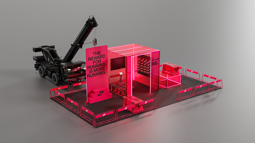
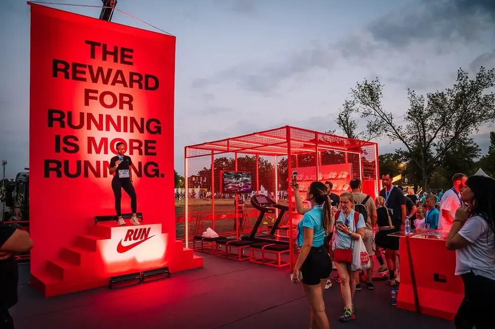
NIKE
This body of work explores spatial brand expression through large-scale activations and environments developed for Nike. Working within established brand guidelines, the role focused on translating direction into complete spatial systems — from scenography and layout to material logic, placement, and movement through space.
Nike 10K — BELGRADE MARATHON
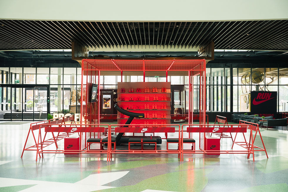
Pop-up activation designed as a modular spatial system for race-day engagement. The environment was developed through 3D visualization and scenographic planning, translating Nike’s performance-driven identity into a functional yet expressive physical space. The concept was later adapted and deployed across multiple shopping malls in the Balkan region.


.png)

.jpg)
.jpg)


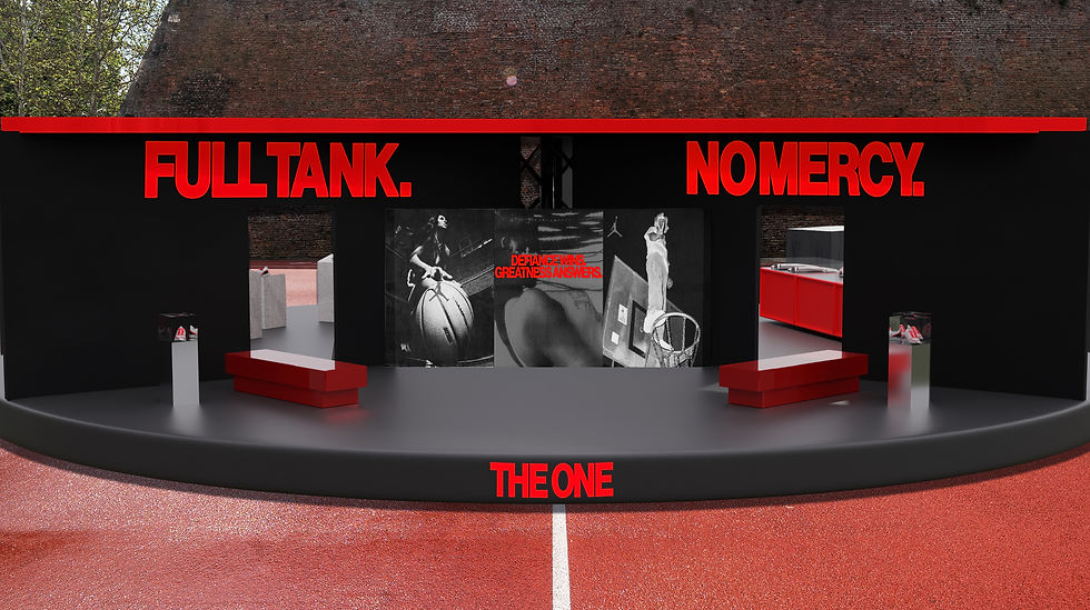
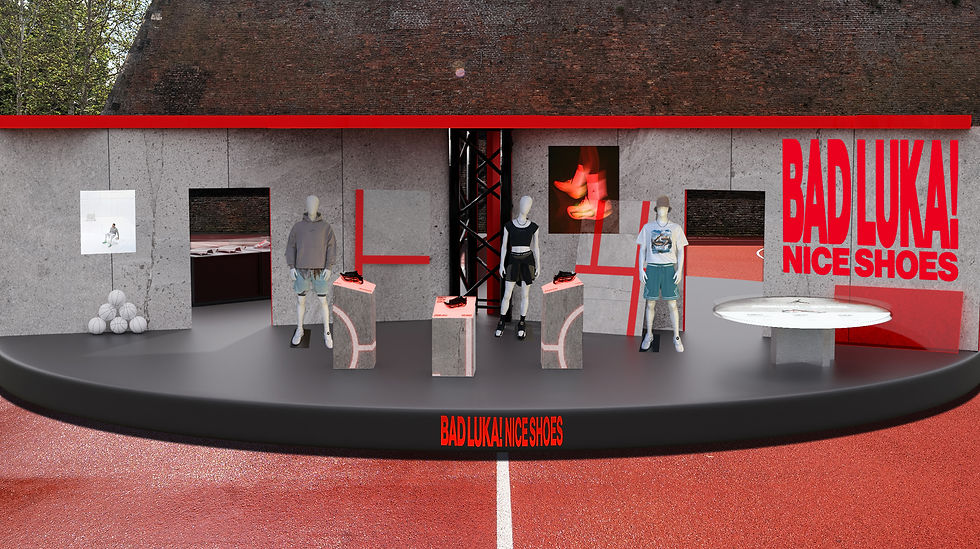
Luka Jordan Camp — KALEMEGDAN
Circular stage and spatial identity conceived as a landmark activation within the event environment. Designed for both ground-level experience and aerial visibility, the structure was supported by surrounding branding, placement logic, and environmental integration — creating a cohesive spatial system rather than a single focal object.


Air Max Day — BELGRADE
Conceptual activation set inside a branded train, transforming transit into an immersive party environment for sneaker culture and community. The project explored movement, sound, and spatial sequencing, positioning the train itself as both venue and narrative device.


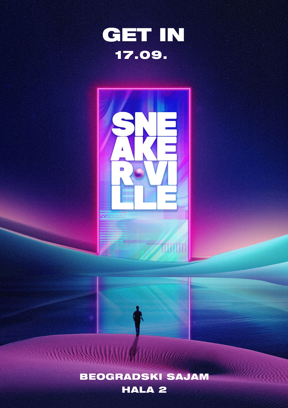
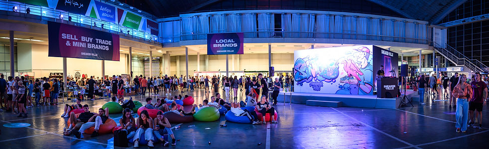
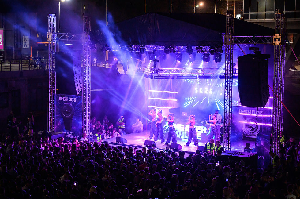
SNEAKERVILLE
PUBLIC CUT
Sneakerville is a festival-scale identity developed as an annual theme, conceived as a portal into a new world of sneaker culture. The visual language draws from sci-fi references, neon color palettes, and forward-moving imagery, positioning the festival as a transition rather than a static event.
The identity unfolded through space, shaping scenography, navigation, key visuals, and environmental graphics across the venue. Rather than functioning as isolated visuals, the system was designed to support movement, atmosphere, and immersion throughout the entire festival environment.
Within this framework, multiple themed brand pop-ups — including Reebok — were designed and integrated into the spatial narrative, supported by a cohesive KV system and on-site applications.


.jpg)

DIRECTOR'S CUT
This project treats festival identity as worldbuilding. The portal concept functions as a narrative device, allowing culture to be experienced through space, scale, and progression rather than surface graphics alone.
OBJECTS
CHAPTER 04
This chapter focuses on objects as design thinking — where ideas are tested through form, material, and use rather than narrative or system.
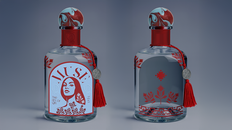
THE ART OF GIN
PUBLIC CUT
The Art of Gin is a platform developed for two premium gins — Muse and Author — conceived as complementary opposites. Light and dark, day and night, intuitive and complex: the two expressions are distinct in character, yet bound together as a single system.
The labels feature illustrated portrait faces of a tattooed woman and a man. While direct in form, the portraits function as archetypes rather than individuals.
The standard editions combine subtle Balkan material references, including a woven threads detail that add tactility and a sense of origin.
.jpg)
.jpg)

DIRECTOR'S CUT
The portraits were a deliberate choice — using familiar visual language to make the concept instantly readable, while allowing material, craft, and restraint to elevate it beyond the obvious. The collaboration with a Balkan glass artist reinforces the idea that the object should outlive its function, not disappear once consumed.
LIMITED EDITION
The limited edition was envisioned as an extension of the object beyond consumption. The concept proposes a collaboration with a Balkan glass artist, where the hand-crafted glass cap becomes a removable element designed to remain in use as a paperweight or sculptural object.
Transparent foil applications carry traditional Balkan motifs across the exposed glass surface, creating the effect of a tattooed bottle rather than a labeled one — ornament embedded directly into the material.
.png)
.png)

.png)
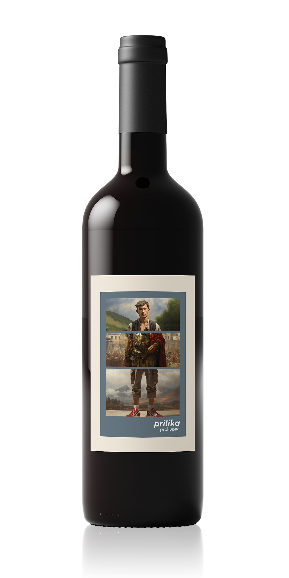
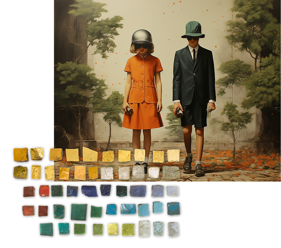
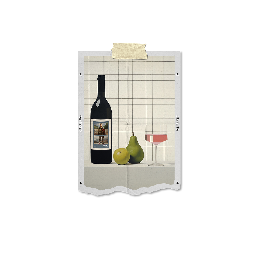
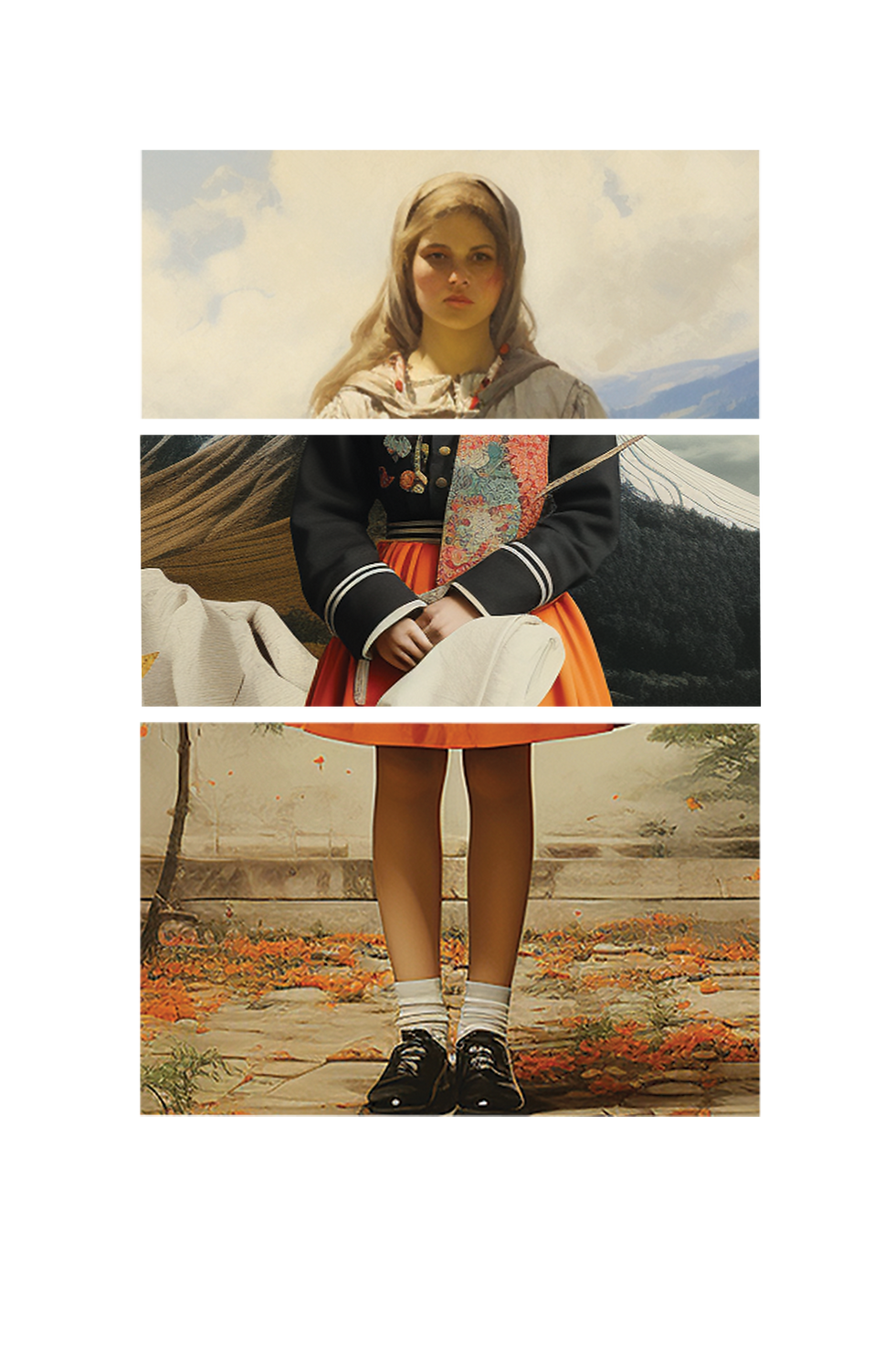
SLIKA & PRILIKA
PUBLIC CUT
Slika and Prilika are two complementary wines made from indigenous Balkan grape varieties: Tamjanika (white) and Prokupac (red). The labels explore heritage without historic literalism. Each wine is represented through a fragmented human figure, assembled from different temporal references: rural life, classical history, and the present day. The compositions function almost like visual riddles; parts of a whole that only make sense together.
Rather than aiming for realism, the figures are deliberately pictorial and explained through suggestion. They act as depictions, carriers of memory, movement, and continuity. The system allows both wines to exist independently, yet remain bound through shared structure and narrative logic.
.png)
.png)
.png)

.png)
DIRECTOR'S CUT
Nostalgia was unavoidable and intentional. The client’s personal history with the vineyard shaped the emotional tone of the project, but the challenge was to translate that memory into a contemporary visual language.
Instead of romanticizing the past, the labels treat history as something layered and lived through. The slightly unreal quality of the figures reflects how memory works: incomplete, selective, and softened over time. This allowed the wines to feel rooted, but modern without erasing where they come from.
What I’d Push Further
I would expand Slika & Prilika into an ongoing cultural narrative. Rather than pairing the wines with food, I would connect them to art, literature, film, and poetry — creating a visual diary that lives through social platforms. Each wine would be associated with images to look at, texts to read, films to watch: moments to accompany drinking rather than consume alongside it.
The project could evolve into a curated archive: small stories of historical and non-historical figures, moods, and cultural fragments that may have crossed paths with these wines — turning the brand into a living, editorial art space rather than a static label.
.png)

.png)
.png)